

Gold Website Design Package
Bronze Website Design Package
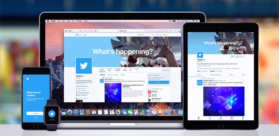
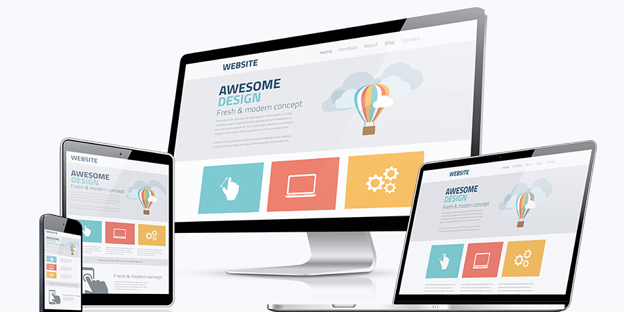
We are a responsive web design company offering such services, providing the viewers with an optimal experience as the pages adapt themselves per the screening device's height and width.
We guarantee pages to fit variable viewing screen measures. Our work process is focused towards achieving your commercial objectives to ensure you achieve the highest levels of return on investment. Whether it's a single page or developing a whole new website, our team of experts has all the necessary skills to achieve your goals.
This approach saves time and cost since it does not require the firm to create a separate page for miscellaneous devices. Furthermore, it can only engage with your mobile audience via a single site.
It is easy to get modern responsive web design templates for your site where the content and growing requirements of the firm can be easily met. At the same time, we eliminate the disorderly, difficult-to-use, and out-of-sync features associated with your brand, all affecting your site's ability to load, attract visitors, generate leads and ultimately, deliver ROI.
| Our web design service combines: | ||
|
- Extensive planning and competitor analysis |
||
|
- Customer-focused design process |
||
|
- Obsessive attention to detail |
||
|
- Applying strategic and marketing insight to designs |
||
|
- Results-driven, accountable design work and processes |
| Our Design service includes: | ||
|
- Full website designs |
||
|
- Landing Pages |
||
|
- Print/Downloadable collateral |
||
|
- Mobile websites |
However, with the growth of mobile viewing and the use of tablets for browsing, developers need to create components where the dimensions are determined as a percentage relative to the viewpoint. The approach was called fluid, as the site's look changed every time the user's device changed.
Responsive web design services are sites that adapt to different screen sizes without compromising the usability and user experience, where the text, the elements, the images, and videos are rescaled and resized as per the user device dimensions.
The coder must write a single code set using HTML, CSS, and JavaScript that can run on multiple browsers, platforms, and screens without getting awry. It is the concept that supports multiple device browsing where the elements in the page align as per the development philosophy of DRY (do not repeat yourself).

What Is Responsive Web Design?
Initially, the designs of sites were not optimized for fluctuating screen dimensions. Mobile screen has a smaller size compared to desktop, and sites with static designs may face misalignment of components on the smaller screen, leading to a decline in page rank as research finds over 40% of the users go to competitors' site if they get a poor mobile experience.
It is necessary to integrate features in the site to suit mobile user requirements that can automatically adjust to the type of device and ensure the user gets all the desired messages accurately without extra effort, like zooming or scrolling.
Such a design can create a system that automatically reacts to the user's requirements. The responsive web design services offer a fluid and flexible mechanism where the site adjusts the layout to suit a laptop, tablet, or mobile viewing.

What is a Responsive Website?
Users who browse on mobile phones do not get much screen space. If the website tries to depict a house, the pictures may not show up clearly if the site is not integrated for responsiveness.
The term responsive web design services was used in the article published in 2010 by Ethan Marcotte, who explained how site developers need to look into the screen size, user orientation, browsers, modes of interaction, and other factors for creating content.
Today, most people use portable devices to order items or food and prefer sites with provisions to depict messages on the phone. Modern phones can zoom out automatically, and the website can be seen onscreen, but if the information is encoded in some part of the site or is not visible to the user, they may ignore it.
Not only images and videos but even the text content posted on the site should also be clear to the users who want to make reservations or look into a restaurant's menu, where a potential customer searching for food items may be in a hurry to eat right now.
Hence, the site design should have readable content for multiple screens without zooming, and the content should have a reasonable load time. The pages should exclude programs or videos that are heavy or are not resizable. The trend is just the start of a new shift in browsing.
Responsive web design services features have the following advantages -
-
It helps to increase the reach of new buyers on multiple systems.
-
It can provide consistent information and user experience that helps to enhance customer retention.
-
It provides tools for tracking, reporting, and consolidating user data.
-
It is useful for content/site management.
-
It enhances competitiveness, is SEO-friendly, and increases the number of visitors to a site.


What is a Mobile Responsive Website?
Some websites are created specifically for mobile viewers. Such a version can be different from the desktop. The mobile site is specifically designed for the Smartphone user. It runs faster on phones and provides a better user experience, but the business has to maintain two versions of the same site, while the content can become outdated frequently.
Such a system requires a robust back end and multiple version integration. In contrast, a mobile responsive site is made for browsing multiple devices and maintained through a single maintenance process.
There are many challenges faced by a responsive web design company when they try to convert a pre-designed page to a responsive as designing the site from the start helps to handle each element involved in the page in a manner to be able to meet the future requirements.
Editing a previously designed code can be difficult because elements, like pictures specifically, are large for desktop users and may not appear clearly on a smaller device.

Guidelines for Responsive Web Design
To create responsive web design, use Bootstrap and extend pre-designed templates. Bootstrap is the framework that provides the HMTL code support, CSS, and JavaScript libraries, which can be used to enforce the mobile-first approach.
One can use it in the project and determine the functionalities dependent on the JQuery. Img fluid classes can scale images and tables to create table structure.
The responsive web development team can use the fluid grid to ensure the design is flexible and the elements have spacing, consistency, and appropriate proportion.
Media queries can be integrated into the CSS to determine the device's breakpoint. The users can even use templates to modify existing styles. This helps to create the whole website with zero design experience.
First, define the Meta viewport tag that tells about the browser, how to scale, and the size of the content at the time of displaying the page. All the information in the code should be able to convey the way the attribute will display on multiple screens.
The page will be displayed without a viewport with the dimension that fits the desktop version. Also, one has to set the minimum and maximum scale for the content, and the viewport can modify the elements where the coder needs to see that the user can scroll vertically but not horizontally.
After completing the design part, the coder should test the display and alignment consistency where they check the following -
-
The text should be clear on multiple devices and appear on predetermined viewports and scales.
-
The text should remain inside the containers.
-
Images should be resized to appear clearly on smaller screens.
-
It helps to resolve the inconsistencies in fonts, colour, illustrations, and other scales.
When resizing the page's basic element, the user should ensure that it does not assign fixed widths to any particular element. Also, the relevant content should be shown on the page appropriately.
A proper code can be written to see that different properties are displayed through the same DOM element dependent on the device on which the page is viewed.

What is Responsive Web Design CSS?
The responsive web design CSS media queries check the device type. The CSS3 allows the page to adapt to the viewport, where you can set font size depending on the device's width. If the width is less than 640px, the font size should be 12 pt, etc.
The code can use the orientation feature, but all devices do not support orientation; hence, most developers use the max-device-width and min-device-width features.
-
One can optimize text where the text size is denoted as px or pt or as a per cent of the size.
-
One needs to include the basic considerations like how many words should be included in the single line on the large and small devices and what could be the smallest legible text size for the given scale and viewport.
-
The images should be responsive by linking the width with the DOM element, ensuring the images resize on different containers and change as required.
-
The img max-width approach can sometimes create performance overload on smaller screens, so optimizing the images to improve latency and displaying the files best on the given network capability is necessary.
-
CSS grid layout can create flexible girds that shrink when required. Multiple column layouts can be used for creating fluid tables.
-
The design of the tables should be modified to fit smaller viewports, or one can include the code to ensure the table design changes on runtime to suit smaller screens. Some websites hide certain columns and display only a part of the table where the user gets the display without interruption, and the user can get a button to scroll across the columns.
-
The navigation buttons or columns should be fluid. Some websites cover the links to drop-down menus generated at run time as per the user device settings. In some, certain hidden elements are created to allow the user to view only the apparent section of the device.

Why is Responsive Web Design Important?
Smartphone provides user-friendly instant leads and sales. In 2015, Google introduced the search engine algorithm to get mobile ranking for pages. The number of users surfing on contrasting devices has increased in the last decade.
Many types of screen structures - TVs, tablets, desktops, phablets, consoles, and wearables- continue to modify and will further change.
If the websites are not optimized through the Meta viewport tag, the fixed dimension and scaling may restrict the elements of the page from appearing clearly to the users, leading to inconsistencies, which can result in a higher bounce rate.
A mobile responsive website has higher readable text and adequate spacing for tabs, with no extra effort required for horizontal scrolling.
The analytics, reports, and tracking of the response on multiple screens can be gained in one place, allowing businesses to track visitor responses easily and effectively.
Since multiple designs are integrated into one system, the time and cost of management are decreased, providing a competitive edge to the site owners.
Most Fortune 500 firms do not have amobile responsive web design. However, there has been an increase in the number of people using smartphones, who conduct everyday business on phones, using the internet instead of going to shopping malls to search for sellers.
With the imposition of new regulations of social distancing due to the growing risks of the coronavirus pandemic, the trend is expected to increase. Many new companies are developing compatible apps with responsive features targeting such traditional users.
Such a system can be integrated into Dynamic Service, meaning the same URL is used everywhere. Still, the design for multiple screen sizes is encoded in different HMTL and CSS Codes. As the user clicks the site, the code identifies the device and then serves the code depending on the type of user machine type.
It is suitable for large content-driven websites where functionality can be accessed through mobile or desktop, and the app looks less native and is suitable for all environments and OS. These are mainly transactional or web apps with better access to remote users.
A responsive web design company develops a single system for building and maintaining the apps working on all platforms and devices where it can easily integrate enterprise security.

The Benefits of Custom Responsive Website Design Services
Responsive websites are proactive, can tell customers exactly what they need, and eliminate unwanted content when viewing. It is the method that can help the sellers to reach out to new buyers regularly and ensure to get happy customers.
It is the method that can help to mask several other issues on the site. The mechanism allows the product sellers to make an impression and get customers easily without struggling to accomplish a larger design, as the content offered on mobile is viewed in seconds. The overall impression is more positive than desktop visitors. Such designs can help improve SEO, as Google prefers mobile-friendly sites.
The management of such a website is easier as compared to the management of different versions for different sizes. However, website creation should be based on the business purpose, goals, and the targeted device.
Suppose a firm determines to create a responsive design. In that case,they need to identify the bare minimum that can start with a Progressive Web App that allows the firm to take an app's functionality and combine it with internet speed to deliver the desired experience.
Since more and more shoppers seek items on smartphones and take quick action, businesses must adapt to the changes for survival and success.

What is a Mobile Responsive Web Design?
By the end of 2016, mobile browsing had become more prominent and widely used than desktop browsing. Today, the market has over 9000 different types of devices. Google has introduced an algorithm that prioritizes websites based on smartphone and tablet viewing.
One can set the scope of their site, where you need to examine how the users access the internet and what core features cannot be eliminated from the versions.
It is necessary to have uniformity in the way the design shows on each device, and the initial design should be made in a manner with scope for later improvement and iterations.
There are many advantages of such designs, as they help to increase the number of customers on smaller screens, and the business gets a consistent increase in leads, sales, and conversions in a short duration.


Frequently Asked Questions
- What is HTML coding?
-
 It is part of web design involving elements, tags and attributes - the designators are categorized into headings in less than () brackets. The pair of closing and..
-
- What is PHP coding
-
 It is the most widely used server-side programming language that offers fast ways to create dynamic webpages that work well with HTML and multiple types of databases..
-
- What does WWW stand for?
-
 It stands for the global information system, the protocols and the formats that helped to resolve the difficulties faced by colleagues where www unifies to create a..
-
- What are Meta Tags
-
 It is the hidden code that provides the search engines with the keywords or texts visible on the result page - that tells what the page is all about. It is useful in..
-
- What are web applications
-
 The web applications UK are stored on remote servers and accessed on the browser through the internet. It can deliver certain function and some are accessible on..
-
- What makes a good website
-
 Some of the best websites have a clear purpose, organized basic elements positioned (on the homepage) as per certain rules, straightforward navigation, clean..
-
- What is web design
-
 It is the basic template designed by web developers as a user interface with several visual imageries to determine how the pages of the site will look and work. It..
-
Related Terminology Explained
- What is responsive web design
-
 The definition of web design starts with "The creation of the site using computer software that facilitates building Web pages to be displayed on any type of..
-
- How to learn web designing
-
 How to learn web designing, Learning the ropes of web design requires time, patience and plenty of practice. There is much to learn, from choosing and styling HTML..
-
- What is web designing and development
-
 Even the professionals would have their own web designers who design for them and produce their websites. ..
-
- Website design and development
-
 Website design and development are businesses where no compromise should be made. Design and development are the most important parts of developing your online..
-
- Professional responsive web design
-
 If you are looking for a professional responsive web design that is affordable, and above all professional, then do some more research. There are many factors to..
-
Our Steps
Why Choose Us
Choose us because we are different, and we have proved it!

We're Experienced
Working with several different Business big and small , you can benefit from our decades of collective experience.

We Listen
We like to get to know our clients and their business properly, so we can determine the best way forward.

We're Results Driven
We believe in action and making the difference that would enhance the flow of your business.

We're Selective
We only say Yes where we know real value can be added and make a significant positive difference.


