

At least 77 percent of adults have a mobile phone, and about 60 percent of the internet is viewed on phones, where 72 percent of the audience wants to see mobile-friendly websites (as per webworks data). ComScore reported half of the e-commerce revenues are generated through smartphones and responsive web designs.
As per SAG IPL stats, 62 per cent of companies increase sales through responsible designs and platforms. The survey by the company found - people will shift to different search results if the first one is not mobile-friendly.
If the organisation is not having a mobile-friendly design, it indicates that the business does not care for its mobile clients.
Creating a website is not difficult, but if someone is planning to invest in web apps or comprehensive development, one should try to identify the purpose and methods of use to get less expensive sites, supported by the low cost of maintenance features.
Such pages should be easily accessible to the user on many browsers and various other devices. These sites or apps should not require downloading or installing on the device.
It should have convenient features of shareability, upgradeability, and integrity while remaining accessible on tablets and smartphones.
 The Statistics On Website Viewing Behaviour Found
-
The increase in loading time can prevent a loss of 7% conversions - by Infront webworks
-
48 per cent of users believe the design is the key factor for determining the credibility of the company - Blue Corona
-
47 per cent of the viewers expect the pages to load in 2 seconds - Blue Corona
-
38 per cent immediately lost interest in the unattractive websites - Blue Corona
-
If the content is interesting, 59 per cent of the viewers will spend 15 minutes of their time on it - Adobe
How Is It Created?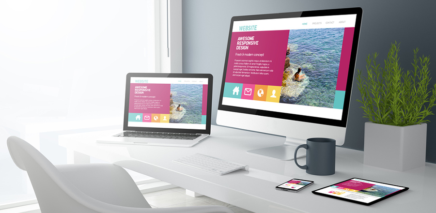
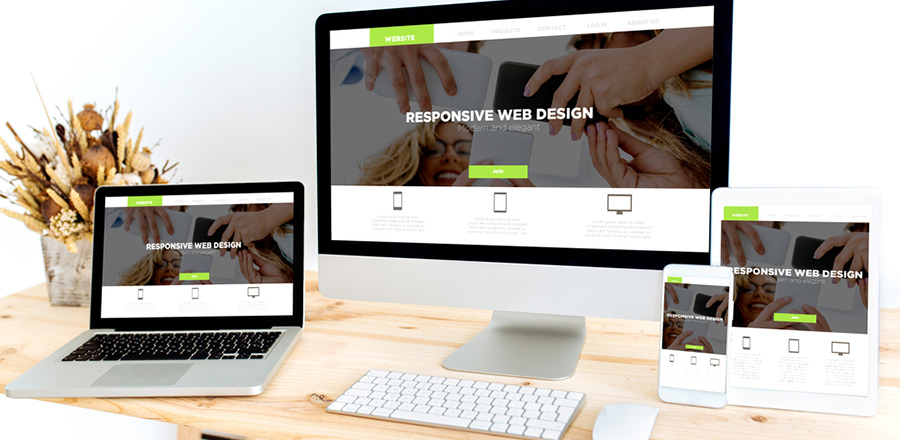
Responsible web design is based on grids (not on pixels), and the pages can be customised to fit the ratios of pixels. The coding resizes the pages when needed within its column or through relative design elements.
The programming method is fluid, with just one website design for different platforms and screen sizes. The pages are flexible, adjustable to varying screen sizes, and such methods also prevent duplicate designing.
Google supports such structures, where the admin pursues the best routines. It utilises the composition and CSS media questions and adjusts pages to devise screens. Such designs promote SEO and POV, and these require a lesser amount of service-side components.
Both PWA and SPA technologies can be used together to get adaptable designs, bringing mobile and web apps in one place. To Develop such designs faster, an HTML5 framework can be used.
Such designs do not just resize the content and images but also provide scope for media adjustment, text movement, and fixing all to the screen size. Moreover, the pages need not be modified for a particular requirement.
For more information, contact Mont Digital on www.montdigital.com or email info (@) Montdigital.com


