
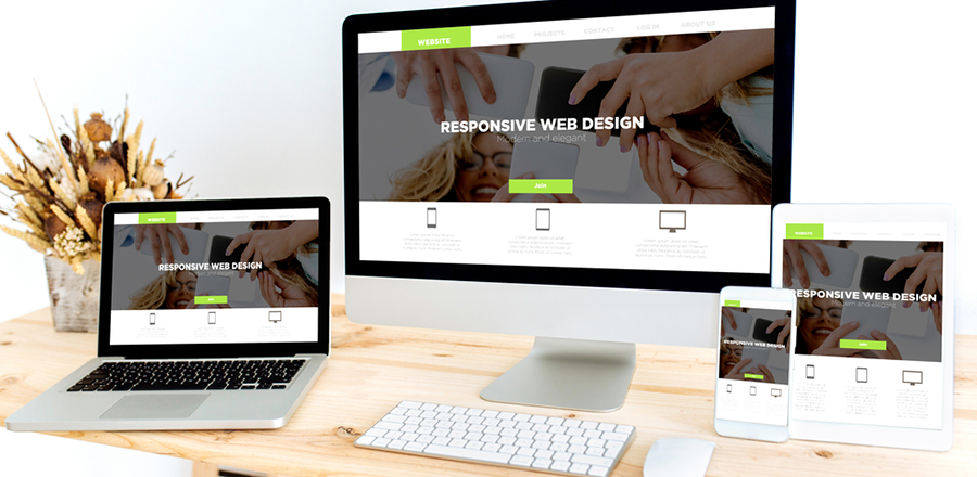
If the website is already running on the desktop, it may require a new display dimension for the other devices having smaller screens. Responsive web design development may be more suitable as it provides a way to retrofit, but if the company requires a new site, one can design the mobile-first type.
In adaptive web design, the developer creates different layouts for different screen sizes where the relevant page is loaded for the suitable screen dimensions. Such designs are device optimised; it may look different if the person visits the page using different devices.
However, one of the system's drawbacks is that the design may need changes to adapt to new screen sizes, and multiple versions of the same pages are developed and modified each time a new feature is added to the site.
 For this reason, storing additional data and maintaining multiple versions requires a lot of resources, which increases developers' work and creates redundancy.
Finally, the page is delivered to the browser, and the changes appear suitable to the window's dimensions.
In many conditions, the approximate resolution is taken, and if the screen size does not match, it can lead to the depiction of the layout which appears imperfect and inconsistent.
It provides client-side updates, whereas, in the case of responsive web design, the layout and scales are determined through techniques like CSS or media queries. In addition, such pages may require certain resolutions where the size may take 30 per cent of the whole page regardless of the screen, and the other part may fill automatically.
The designs on the adaptive server side are modified before it is delivered to the browser. The pages may be optimised for each device, and even in responsive web design, one may require multiple versions of the same to suit the individual requirements as there are infinite screen dimensions. It requires a lot of work to manage.
But one of the user-friendly features is that it can be easier to manage on responsive than on Adaptive Web Design, as the changes to content are made only in one place.
AWD can be useful when one requires regular updates, as the changes can be easily integrated without affecting the entire content. It also supports a strategy where the adaptive guidance helps to ensure consistency across page layouts, and it also helps to ensure the flow of information is steady in the Adaptive Web Design.
Design can be selected depending on the requirement of the client. For example, if the page requires fast loading, AMP can provide a lightweight site version where rich content is eliminated.
It also helps improve the SEO of the page as the page download speed is improved due to the presence of a lighter version of HTML, JS, and CDN, improving desktop and mobile indexing.
Google initially introduced AMP pages to compete with Facebook's instant articles. Hence, it is supported by multiple platforms, search engines, and browsers.


